Website · PPHU Lepsza Energia
Lepsza Energia: a cinematic story about energy
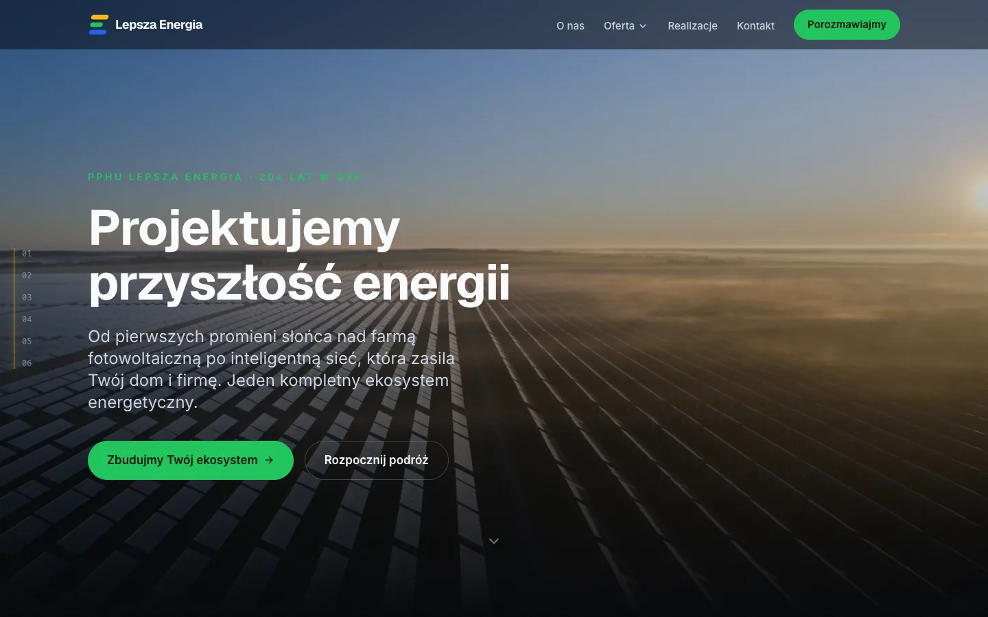
A renewable-energy company trading since 2003 had a site from 2020 that read like an installer's catalog. We replaced it with one continuous story in nine chapters, each opening on its own cinematic shot, and built the rest of the brand around it.
- Client
- PPHU Lepsza Energia
- Year
- 2026
- Address
- lepszaenergia.pl
- Stack
- Next.js static export
- GSAP + ScrollTrigger
- Tailwind CSS 4
- AV1 / VP9 / H.264 hero video
- home.pl shared hosting
Starting point
Lepsza Energia has been in renewables since 2003. It builds solar farms on horizontal trackers with bifacial panels, battery storage, hydro and wind, and runs its own iEnergia24 metering readout. The site said none of that. It was a 2020 build with an offer page, a photovoltaic-systems page and a footer reading "LepszaEnergia 2020".
The company runs out of two locations: the head office and warehouse in Dwikozy, Świętokrzyskie, and an office in Niepołomice near Kraków. There was no contact form, no map, and departments were listed as a wall of phone numbers.
The brief we wrote back listed what the new site would leave out: stock photography, smiling families in front of panels, and eco-clichés like leaves, light bulbs and green wallpaper. It also ruled out anything that looks like an installer's catalog, because every competitor already does.
The vision: sunrise to sunset
The concept deck set one goal: the site should work like an interactive documentary about modern energy infrastructure. Instead of browsing subpages, the visitor moves through a single ecosystem: sunrise over the farm, then storage and energy management, then EV charging.
The reference points were named openly: Apple, Tesla Energy, Stripe, Vercel, Linear, SpaceX. We aimed for the same register: minimal, cinematic, technically precise and calm.
The whole journey has one closing frame, written into the concept before a line of code existed: an aerial shot showing the scale of the delivered projects, then a warm sunset over the company's own site, and the invitation to get in touch.
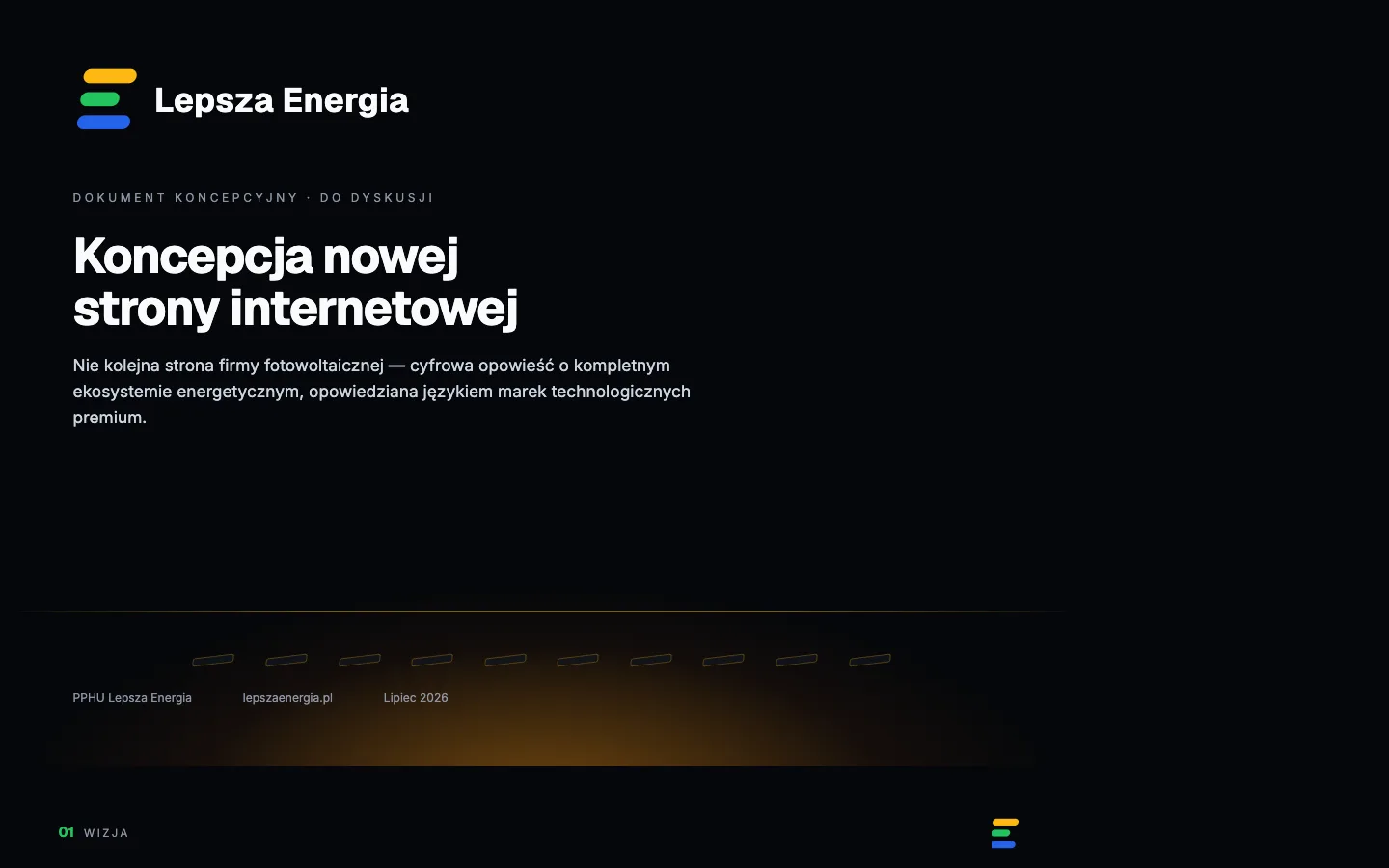
The concept deck: the chapter chain from sunrise to the contact page The mark: three streams of energy
The mark was designed alongside the site rather than after it. Three tilted pills form the letter "E": gold for photovoltaics and morning light, green for the brand and for action, blue for storage. The middle bar is shorter, which is what makes the silhouette read as an E.
The tilt is −8°, so the streams lean forward as if moving. The pills are fully rounded, matching the radius used for the site's cards and buttons, so the mark and the interface share one geometry.
The same colours mark the chapters of the site. Brand green is used only for things you can act on: buttons, links and active navigation. Each chapter gets its own thematic accent instead.
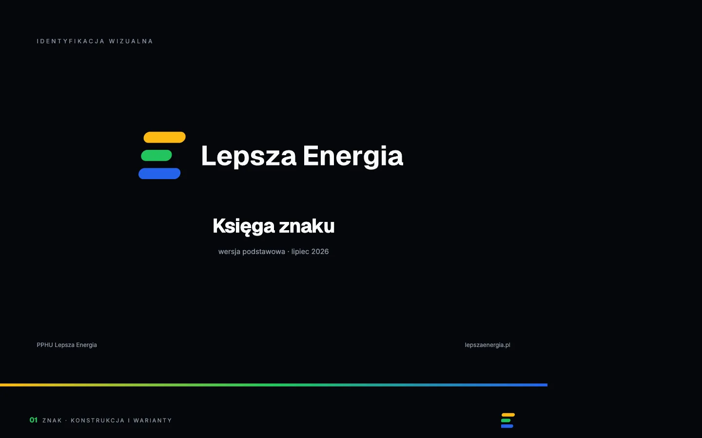
The mark in its full version, as a signet and in mono Build: nine chapters, nine shots
We shipped nine routes. Each opens on its own cinematic hero loop and ends with an "Energia płynie dalej" handover to the next chapter. Scrolling moves you through the story without hard cuts, and the footage settles on its last frame instead of snapping back to the start.
The photovoltaics page carries an interactive "a day in the life of a tracker" simulator. Scrolling drives the sun across the farm and the tables behave as they do on a real one: flat at dawn, opening east under backtracking so no row shades its neighbour, tracking to the mechanical limit, lying back down in the evening. Underneath, the page computes the real solar geometry for the farm's coordinates.
The client corrected us on that footage, and he was right. The first shots had the tracker tables moving at dawn in a way real ones do not. Both were regenerated: flat at first light, rows on a north-south axis, rotating toward the sun only late in the shot. We told him plainly that the footage is AI-generated with Higgsfield and Seedance, so full physical precision is not something we can guarantee.
Some material from the client did not make it to the site, and we said why. Raw SCADA screenshots and supplier diagrams in someone else's branding would have looked like a leaflet pasted onto a dark, coherent page, and the publication rights were unclear. The substance went in, described in our own words and drawn in the site's own style.
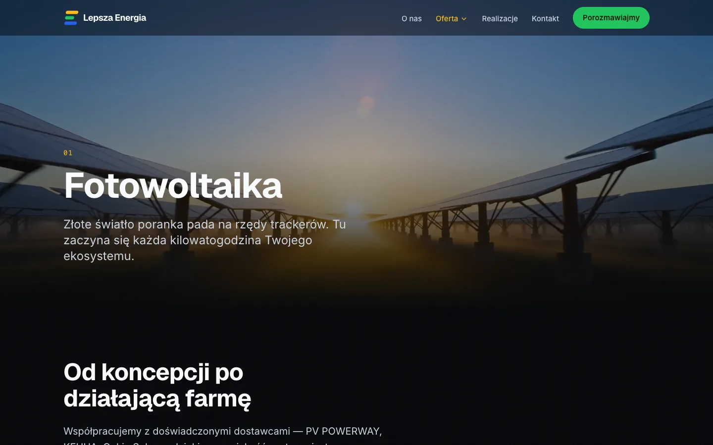
lepszaenergia.pl: the photovoltaics chapter and the tracker day-cycle simulator Beyond the site
The scope grew past the site itself. Around it we built a new mark with a brand book, business cards, a social kit, document and presentation templates, and an e-mail signature.
Two of the deliverables are tools. The business-card generator composes a card for anyone in the company, so a new hire types in their details and gets a print-ready PDF without waiting for a designer. The social post generator turns a line of text into a finished post in the brand identity, in three formats and four chapter-matched colour themes.
Both generators are ordinary pages under the site's own address, with the brand fonts embedded. They work on a phone as well as on a desktop. We left them out of the menu on purpose and disallowed them in robots.
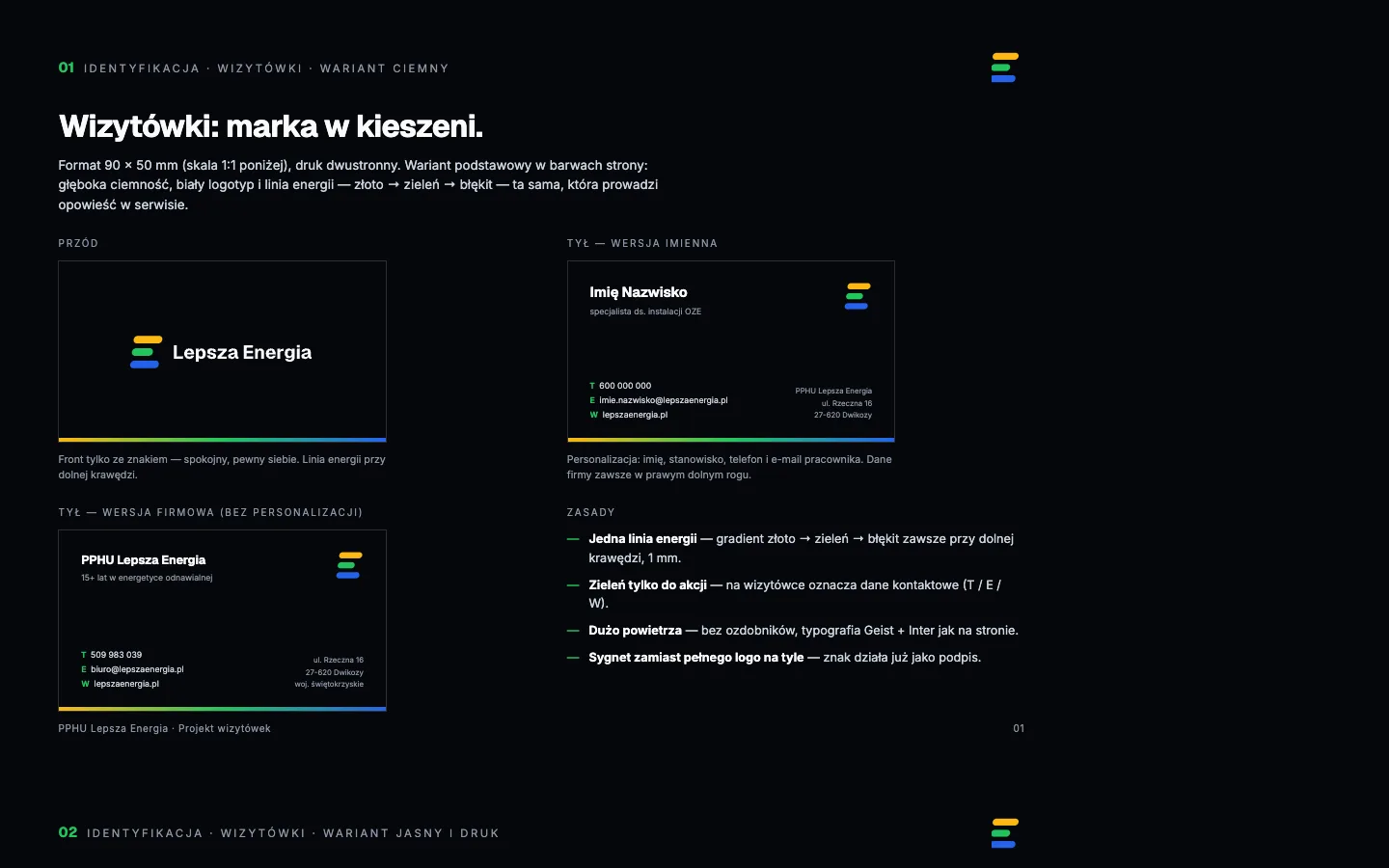
The business-card and social post generators running at lepszaenergia.pl Launch
The site went live on lepszaenergia.pl as a fully static export on home.pl shared hosting. With no database and no CMS, there is little to attack. The export is served as plain files because the host ignores rewrite rules.
Company data, the offer and the menu structure live in one configuration file, so changing a phone number or a service name updates every page at once. The "years in renewables" figure is computed at build time from 2003, so nobody has to correct it each January.
The twelve projects on the site are real client investments with their own photographs and technical descriptions, filtered by category and plotted on a coverage map. We removed every placeholder project before launch.
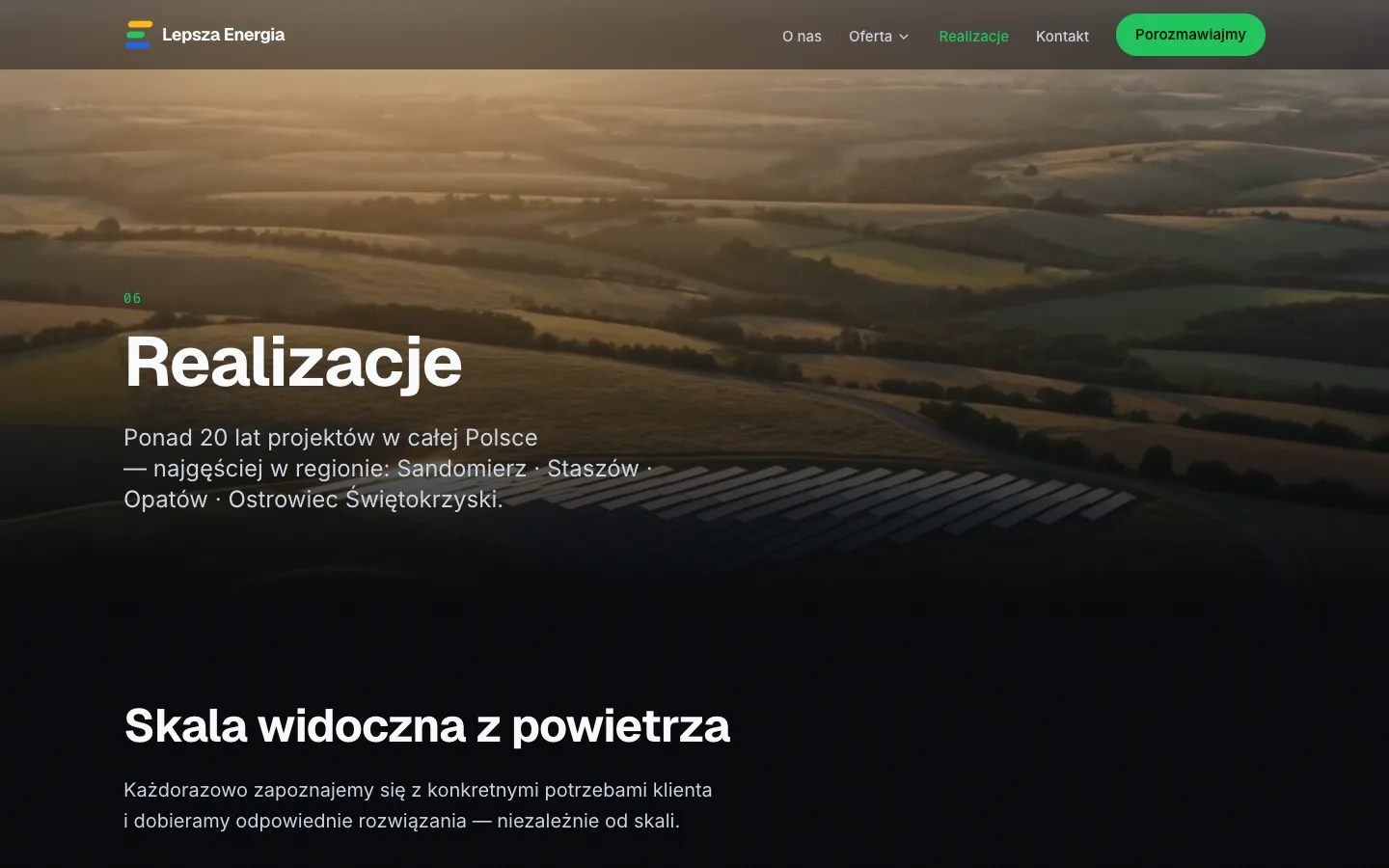
lepszaenergia.pl: the projects chapter, portfolio grid and coverage map
What shipped beyond the site
The site in nine chapters
Nine routes, cinematic narrative, full mobile version, contact form, nine original hero videos.
Mark and brand book
The new mark plus a PDF brand book: construction, clearspace, permitted versions, palette for screen and print, typography, and a catalog of misuse.
Logo file pack
SVG vectors and PNGs from 256 to 2400 px: full version, light background, mono white and black, and the signet in every variant.
Business cards and generator
A print-ready PDF design plus an online tool that composes a card for any employee, dark or light, straight to print PDF.
Social kit and post generator
Profile avatar, Facebook and LinkedIn covers, post template, and a generator for square, vertical and story formats in four chapter themes.
Presentation and document templates
A PowerPoint .potx with brand slide layouts and packaged fonts, and a Word .docx letterhead with header, registered-details footer and brand type styles.
E-mail signature
The signature design plus step-by-step installation for Outlook, Gmail and phone mail; it renders correctly where images are blocked.
Outcome
- Lighthouse on the deployed site, August 2026: 100 performance, 96 accessibility, 100 best practices, 100 SEO.
- All nine chapter routes live at lepszaenergia.pl as a static export.
- Sitemap and robots submitted to Google Search Console and accepted.
- Twelve real client projects published with photographs, technical descriptions and a coverage map.